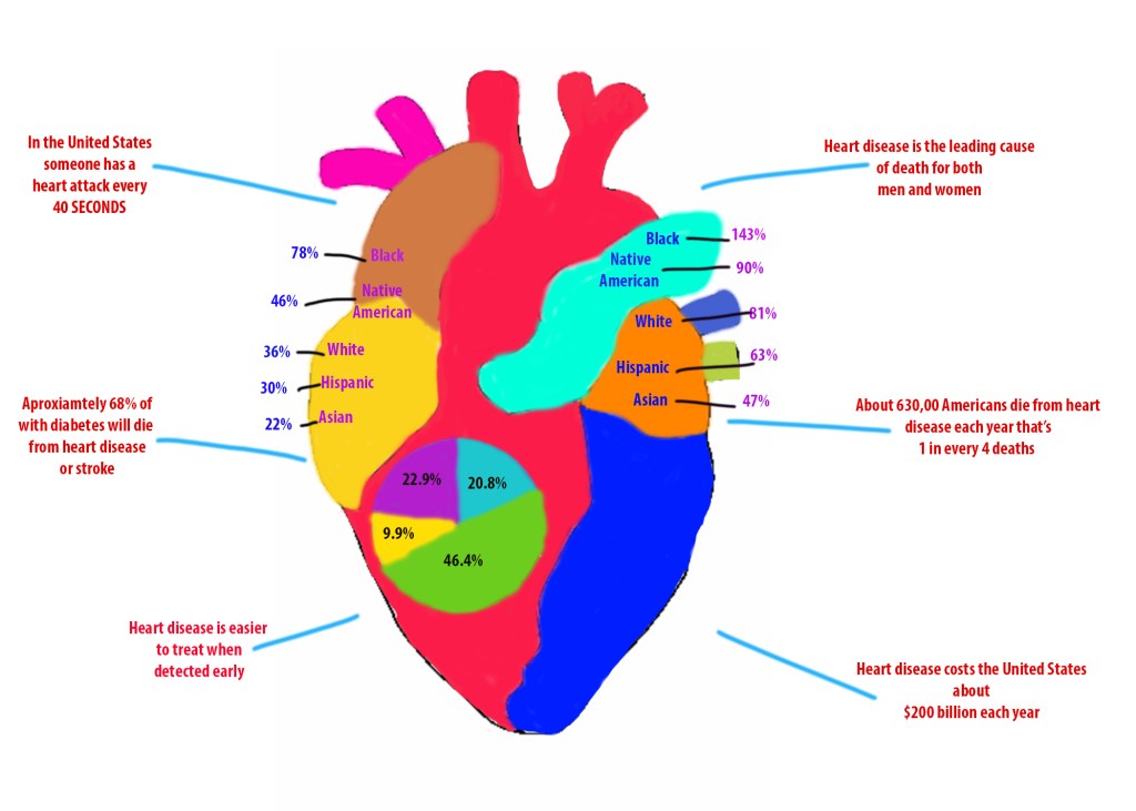
My anatomical drawing of choice was the heart, and I chose to focus on heart disease. Surrounding the heart are facts and statistics regarding heart disease. My first infographic represents the races that are at the highest risk of dying early from heart disease and stroke. The left side represents women and the right side represents men.
The second set of statistics which is represented with a pie graph illustrates heart disease and stroke statistics from 2018. Blue= treated and controlled, Green= treated and uncontrolled, Yellow= not treated but aware, and Purple = not aware.
